Articles ·
How to make a high contrast home screen
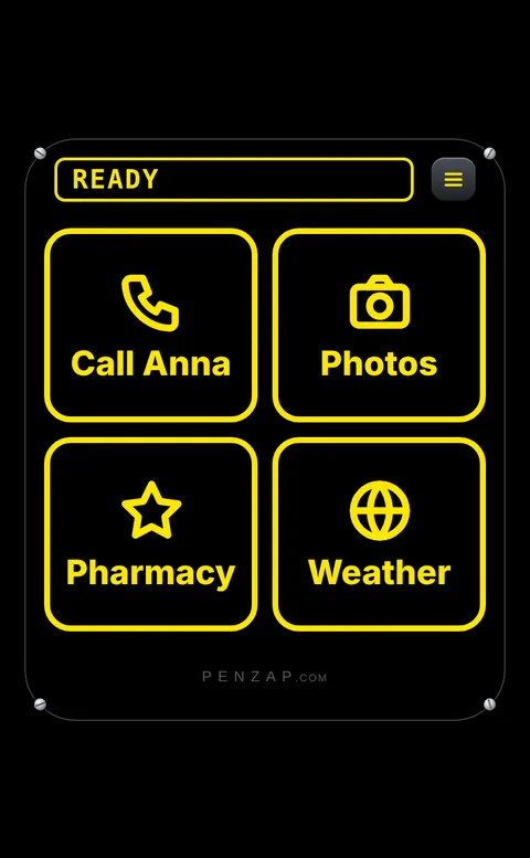
For many people with low vision, the hardest part of a phone isn't size, it's contrast: pale icons on a busy photo wallpaper and thin gray labels. Bright lettering on black is far easier to pick out.
Built-in settings
- Dark mode (iPhone: Settings → Display & Brightness; Android: Settings → Display → Dark theme) puts light text on dark backgrounds in most apps.
- Increase Contrast (iPhone, Settings → Accessibility → Display & Text Size) and High contrast text (Android, under Settings → Accessibility) make text and buttons stand out.
- Bold Text helps thin letters.
- Use a plain black wallpaper. Photos behind icons make them harder to read.
Why home screen icons are still hard
Even with these settings, app icons stay small and every app picks its own colors. App names under the icons stay small too, unless you make all text on the phone bigger.
A screen of yellow-on-black buttons
With Penzap you make one screen of just the buttons that matter, in High contrast: black buttons with a thick yellow (or white) border, a big icon and a huge label. It's free.
- Open penzap.com on the phone, or get the Penzap app, and make a free account.
- Set up 4–8 buttons: a short Label for each and what it does, like Call a number or Open an app.
- Open Easy to see and hear → High contrast → Yellow on black or White on black.
- For one huge button per row, go to Remote size → Big buttons → 3× · 1 per row.
- Tap Use, and put Penzap on the home screen dock.
Add Talking buttons if it helps to hear each name, and Ask before it acts to check before a call goes through.